

Major TV channel refreshes its 30-year-old logo
US-based CNBC is changing its logo after 30 years to create a new brand identity.




The US-based financial news channel CNBC is stepping into a new era by changing its iconic peacock logo after 30 years. The channel will officially begin implementing this new brand identity as of Saturday, December 13, 2025.
The new logo was first unveiled on December 4, 2025, at the Versant Investor Day event. In his presentation to investors, CNBC President KC Sullivan stated that this change symbolizes the channel's future direction and its entry into an exciting new era. Sullivan emphasized that CNBC maintains its strength as a global brand.
The new design highlights CNBC's expertise in the financial sector while also referencing the original 1989 logo. The “N” at the center of the logo bridges the past and the present. The upward-pointing arrow symbol is both a part of the channel's graphic language and represents growth in financial markets.
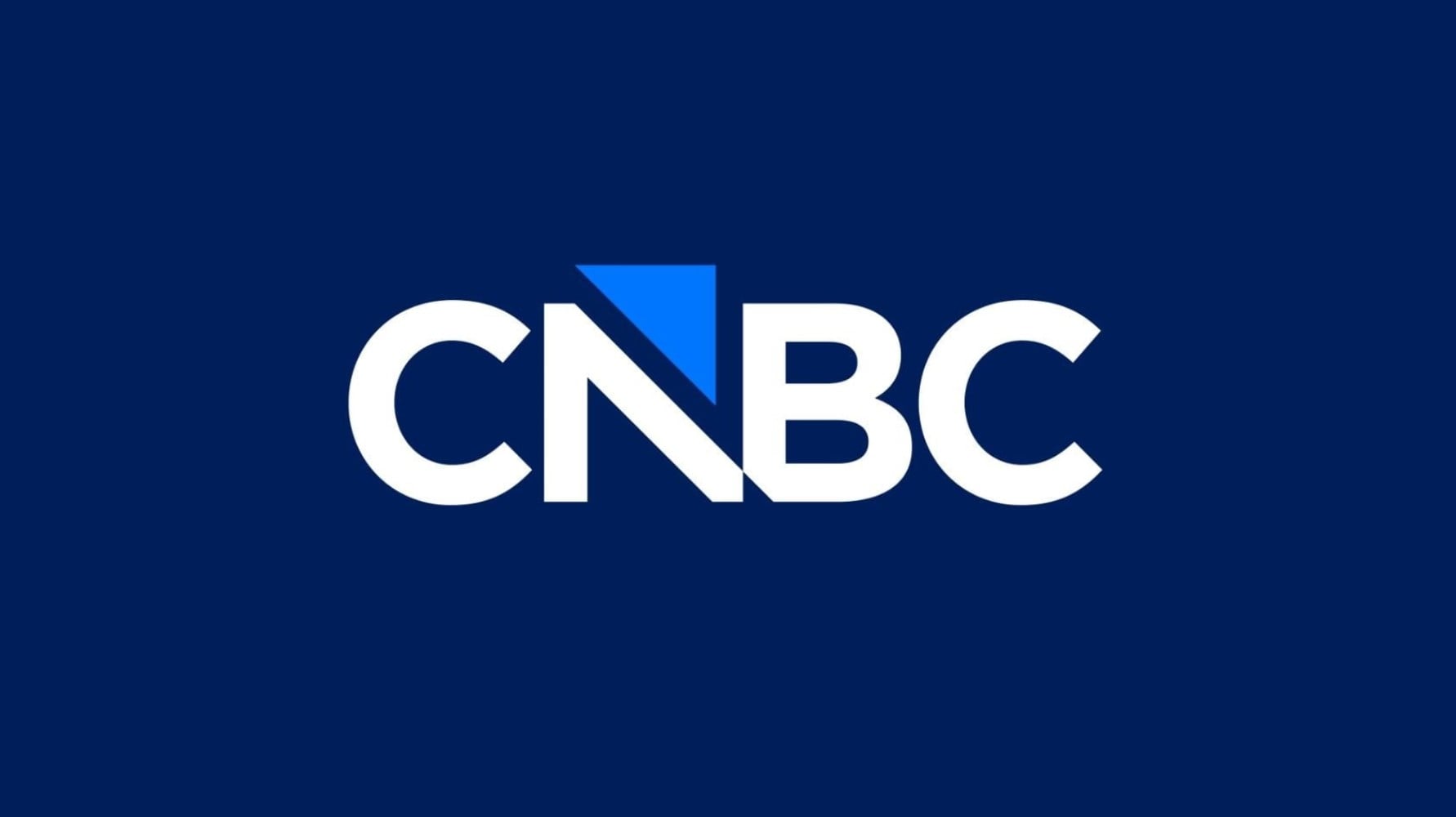
The arrow symbol is a continuation of the “fragmented square movement” approach used in CNBC's 2023 broadcast design. Designers state that the arrow creates a visual connection with the old NBC peacock and resembles a feather left behind.
With the change on December 13, CNBC is expected to introduce innovations in many elements, from program openings to studio decor. While animations and graphic effects referencing the NBC peacock are being removed, the channel began airing a special series of promos introducing the new brand identity starting December 5.
News Source: 12punto
Most Read
Striking picture for Özgür Özel's 'New Party'

The PKK opening and Özgür Özel’s path!..
How did the newspapers view Özgür Özel's farewell to the CHP?

He killed his wife by slitting her throat: Their children witnessed the moments

What did the CHP do?

Özel’s new party move in the world press

The New CHP, against CEHAPE

Fire at TUSAŞ engine factory in Eskişehir under control

From self-efficacy to despair
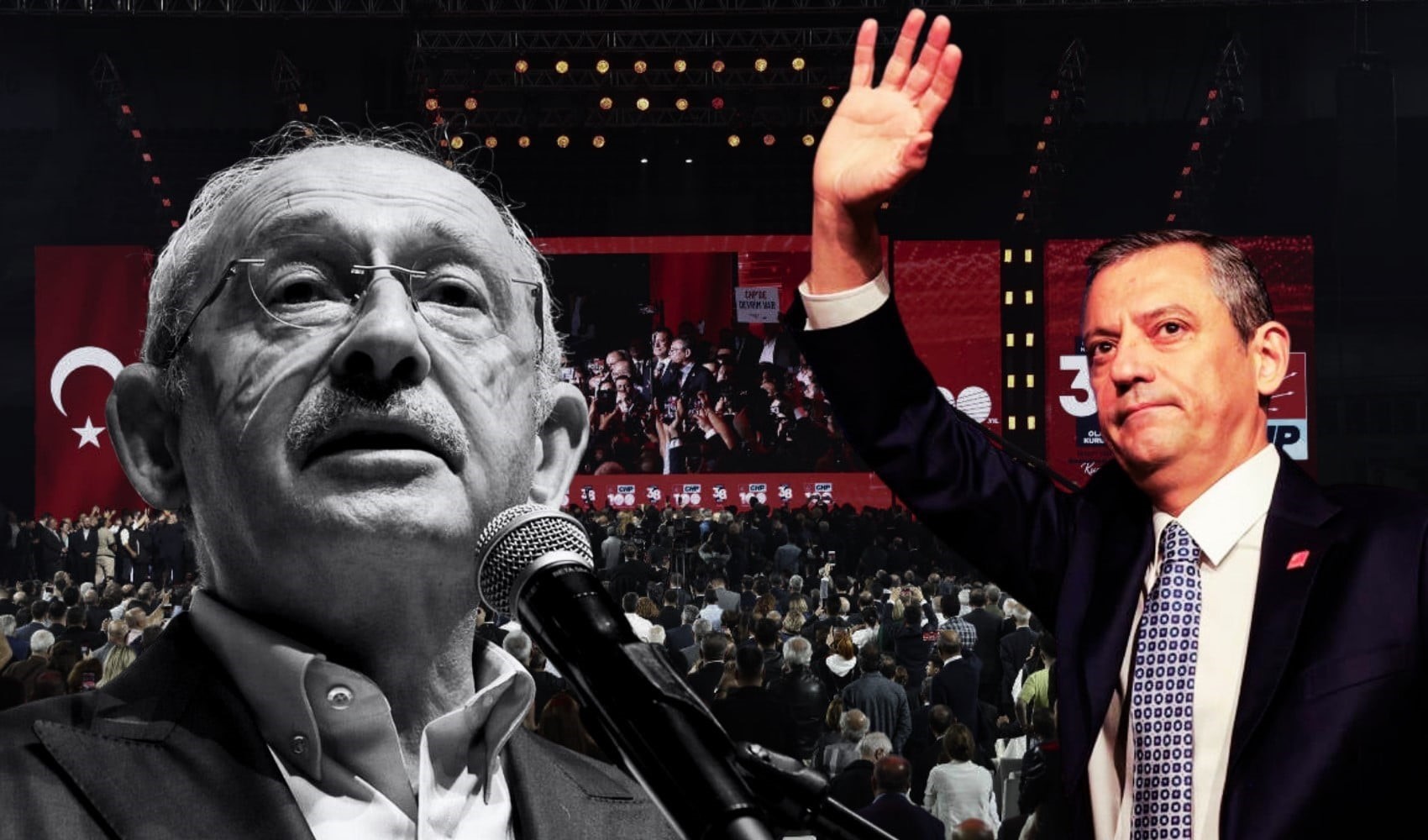
Kılıçdaroğlu's first message on Özgür Özel's new party announcement